Imperfect Kodachrome for Capture One

£12.00

You’ll also earn 10% credit towards future orders

A legend comes to Capture One...

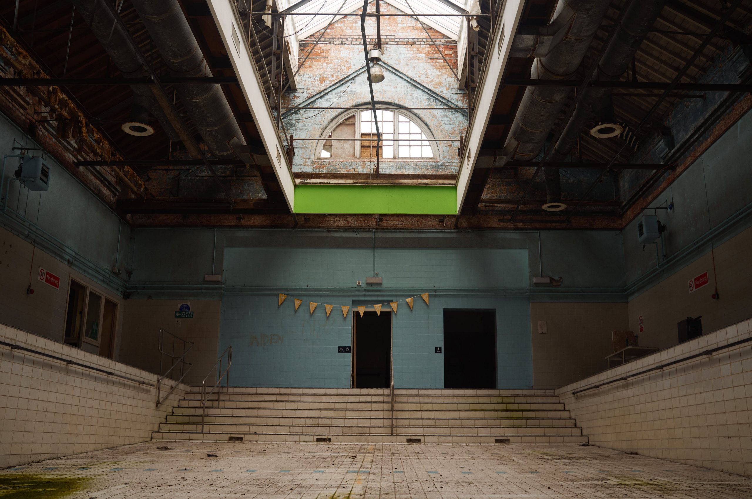
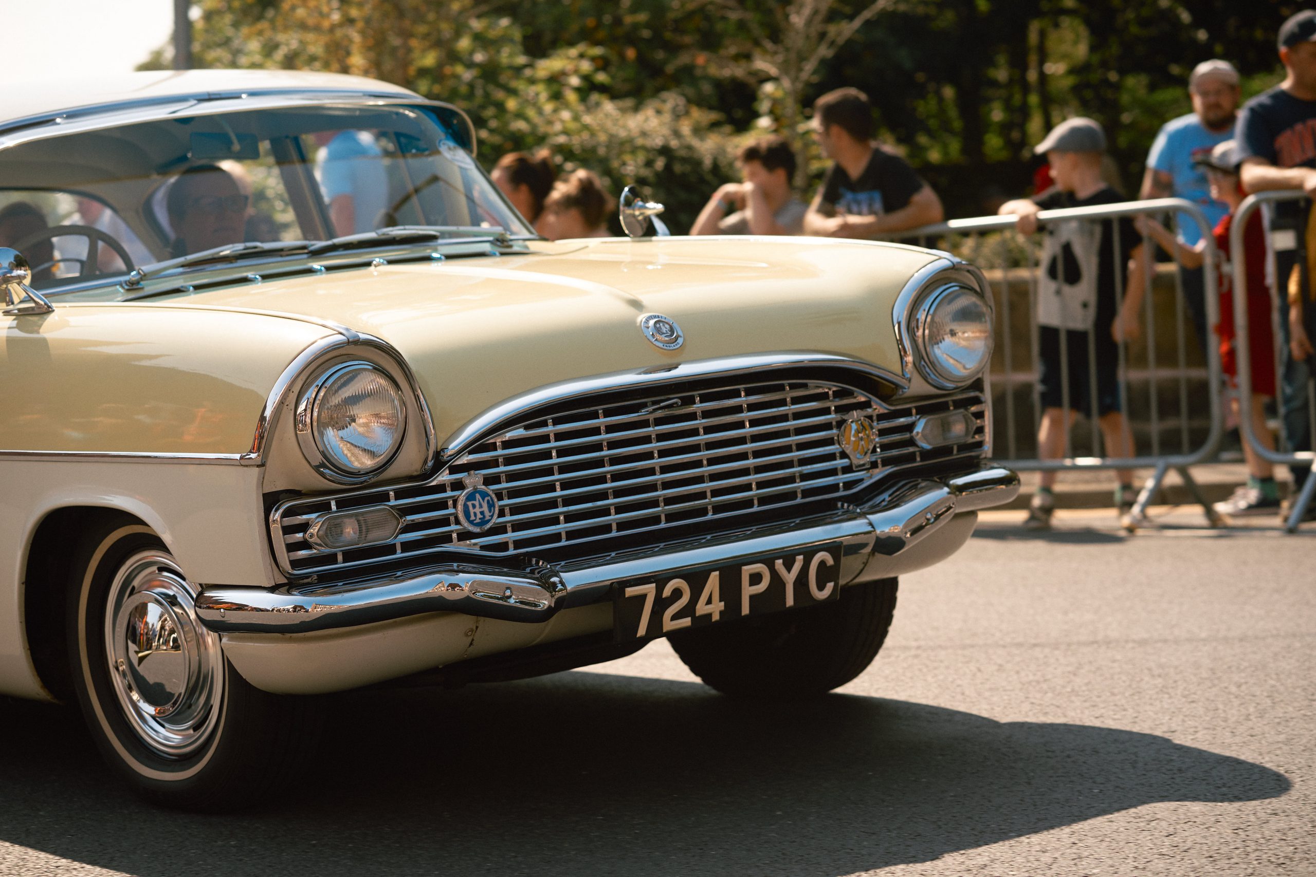
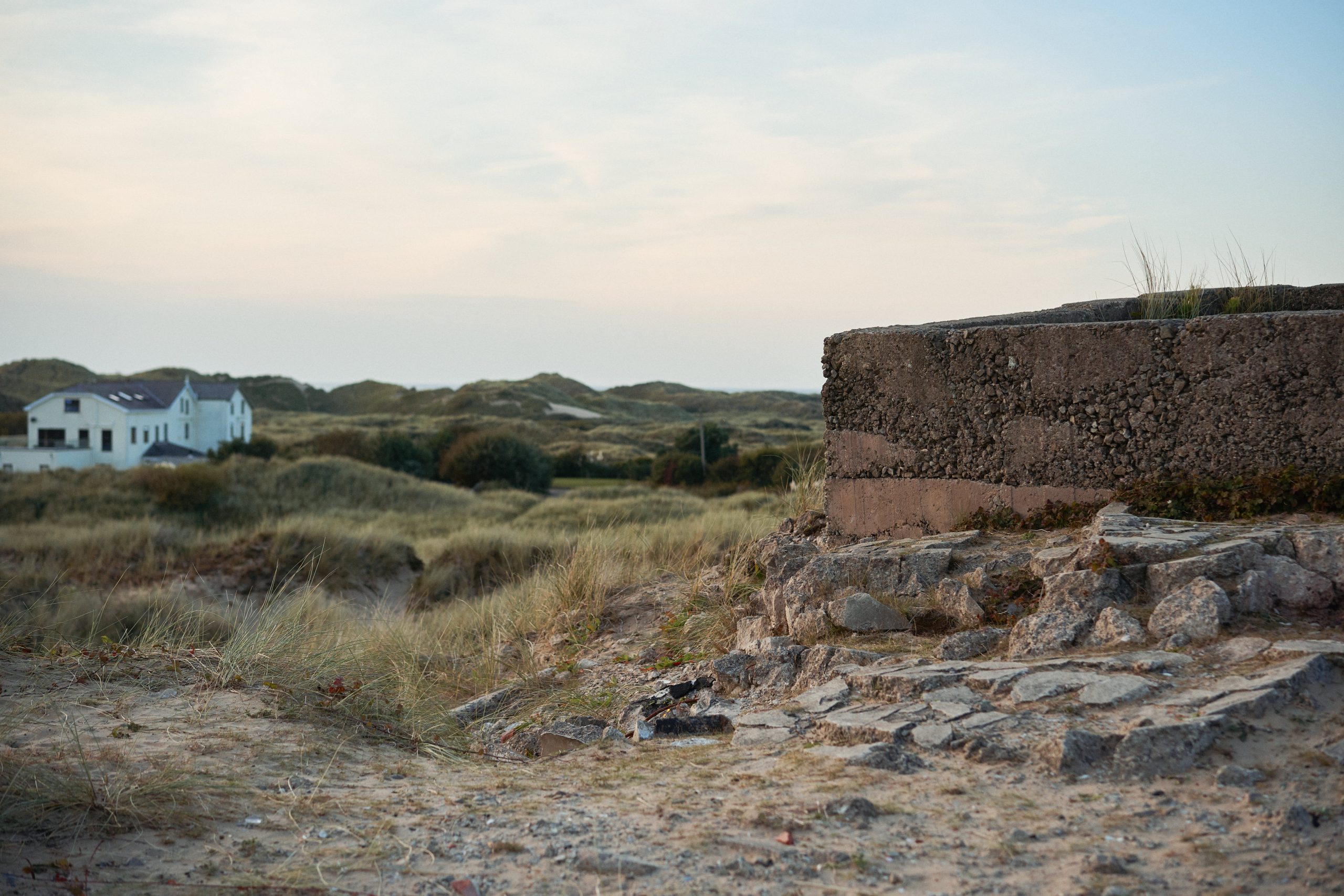
There’s a reason Kodachrome doesn’t show up often in preset makers’ portfolios – it’s really, really hard to get right. The fact it’s no longer possible to process it means a lot of the usual methods for making film styles simply can’t be done, it’s more of an art than a science. There’s not really been any accurate emulation that I’ve come across (though I hope this pack is a step in the right direction), but the real deal was developed for the last time in 2013, and it’s highly likely that’s all we’ll ever get.

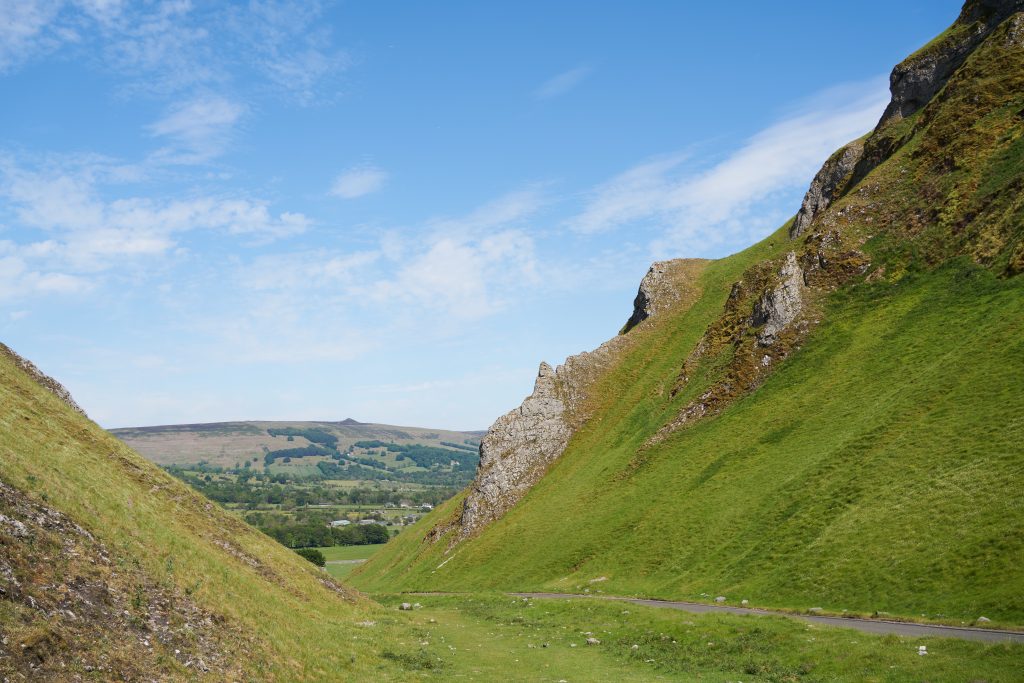
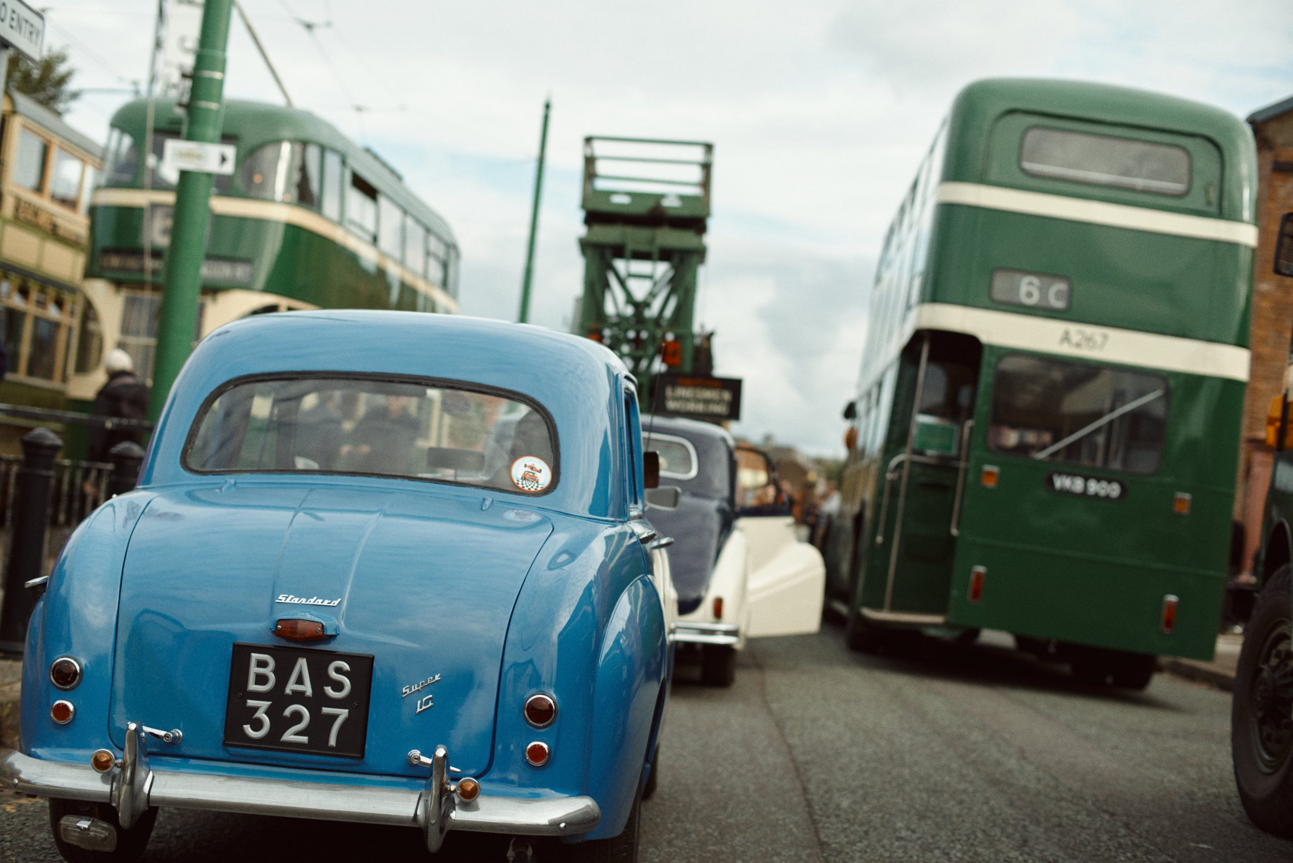
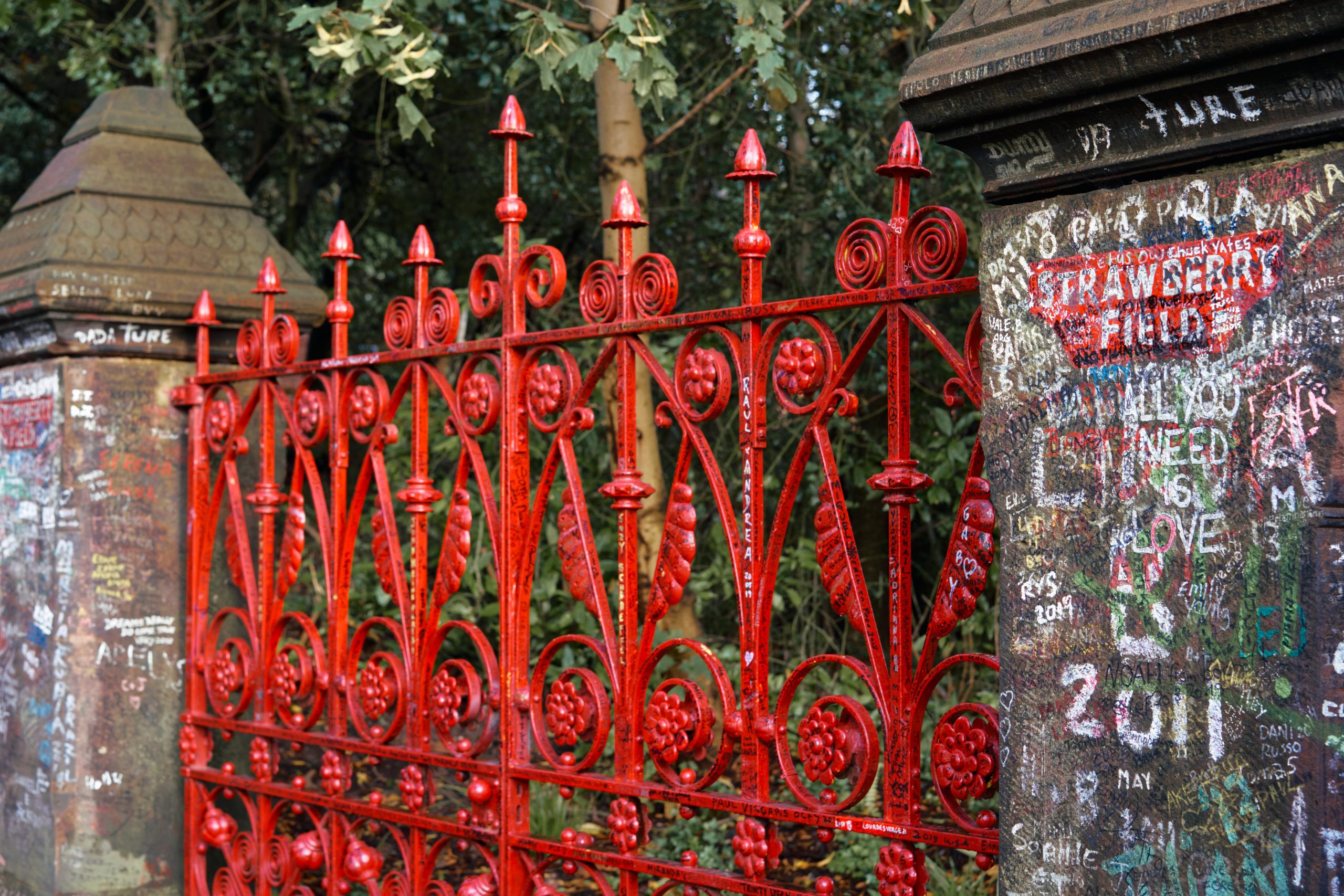
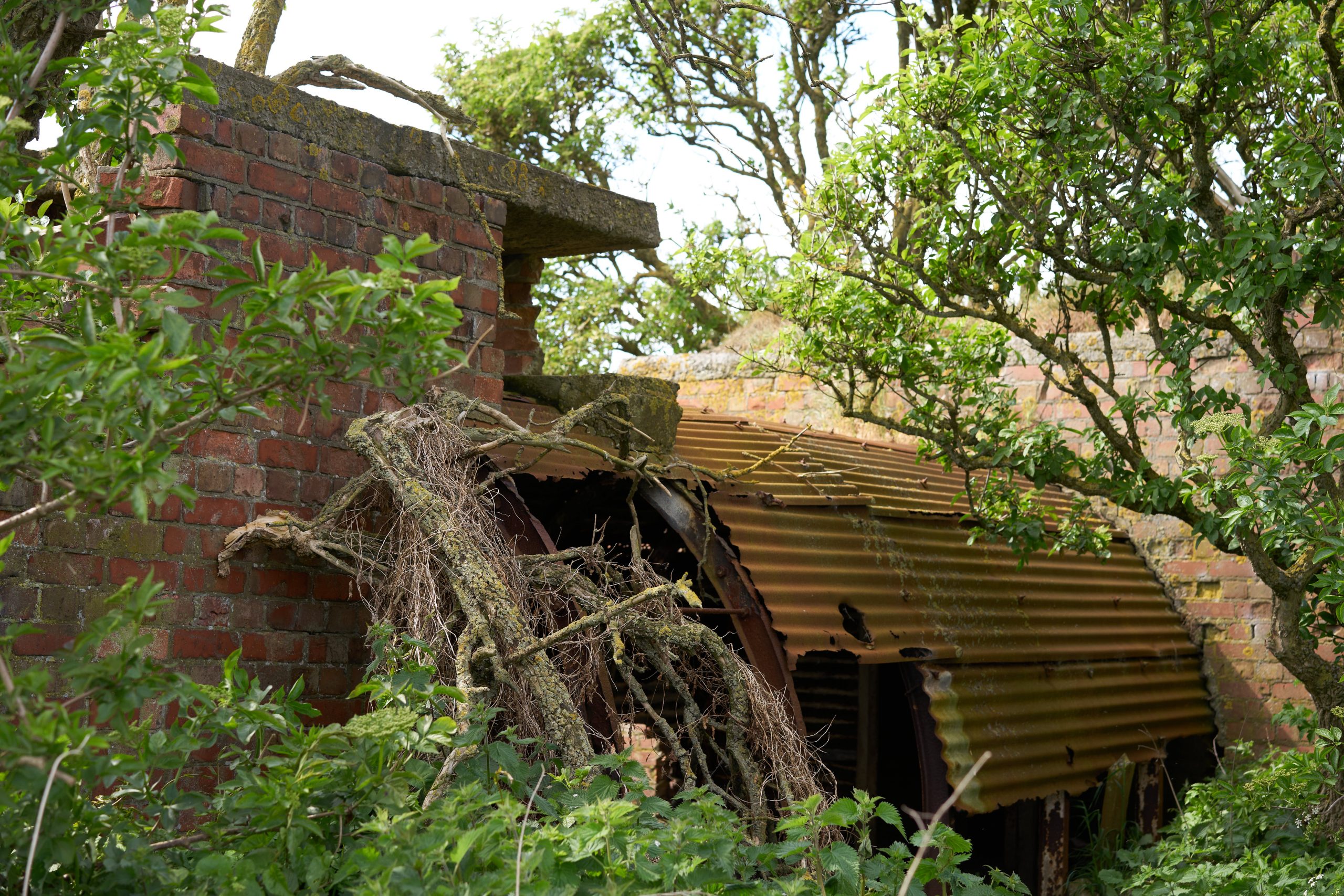
Why did I call this pack ‘Imperfect’? Because I don’t think it’s possible to accurately emulate a film stock that spanned so many decades, used several different emulsions and processes, and is no longer available. I’ve done my very best to capture the look and feel of these iconic transparency films throughout the decades, however, and I hope you find these styles useful and versatile.

To keep things simple I’ve put the main presets in two folders – Clean and Grain. Exactly the same presets in both, the only difference is the grain versions have simulated film grain and softness, and the clean ones – unsurprisingly – don’t.

PS: A quick thanks to my late grandad John Gerard – a veteran of the D-Day landings and keen amateur photographer – for leaving behind a wonderful archive of Kodachrome slides from the 50s, 60s and 70s. I’ve spent many hours poring over these, scanning them and in some cases revisiting the same locations he shot, and that’s influenced my personal idea of the ‘Kodachrome look’. I hope I’ve done it justice!

What's In The Box?

STYLES:

K25 – Kodachrome II/25

Released in 1961 as Kodachrome II, and in the mid-70s changed to Kodachrome 25 using the new K-14 process with new dyes and better sharpness, but I’ve bundled the two together here since they share a similar look. Rich timeless colours, incredible detail, plenty of contrast – it’s an all-purpose film (though it shines most of all for outdoor scenes).

A fairly subtle shift in colour and contrast, reminiscent of a scanned slide from the last two decades. Warm, rich reds and a slight shift in the greens, with a subtle lift in the blacks.

 A good everyday preset, with deep shadows and a neutral tonality. Foliage and other greens shift a little towards cyan.

More of a vintage look, like a typical 1970s/80s slide. A little less contrast and saturation with skintones taking on a slightly orange hue.

Inspired by slightly faded 60s slides, a desaturated, almost matte palette. Greens take on a cool cyan hue, and red-orange shifts towards rusty tones. Can create some strange skintones on certain images, but great on others.

Bright, punchy and saturated. Based on old landscape shots my grandad took on K25 in the 1960s.

A green-blue cast and lifted blacks help recreate the look of an old slide, perhaps one that’s not been stored well.

Not based on any particular slide I’ve seen, just a generally aged variant. great for fashion etc, or added as a layer and blended.

Digistock K64 Classic
C1 Defaults
Digistock K25 Vintage
C1 Defaults

K64 – Kodachrome-X/64

The younger, faster brother. Originally released as Kodachrome-X with a faster ASA64 speed, and updated in the 1970s as Kodachrome 64 with the new K-14 process. Often unfairly represented as having a magenta/pink cast, perhaps due to its unforgiving nature with exposure. Used commonly by documentary and portrait photographers, and perhaps with slightly more flattering skin tones than the ASA25 versions.

Bright, saturated and a little warmer than the ISO25 version. Nice skintones, great for general-purpose documentary and portrait work.

A typical look from older Kodachrome 64 slides. This variant has a slight green/blue tint and a punchy contrast. Another good all-purpose variant.

Contrasty with deep shadows, like a professional scan. There’s a subtle magenta cast as seen in a lot of older shots.

A slightly matte look. Subdued greens with cool colours and reduced saturation, lots of shadow detail. Nice for outdoor portraits, add contrast as needed.

Moderate colour shifts, nice saturation, good for landscapes. This exhibits a little more of the ‘pink sky’ some people associate with the ASA64 film.

A more 60s/70s, soft look with the magenta cast sometimes seen in K64.

A warm, heavily faded look, like an old 50s slide that’s been stored in the sun! An overall red cast, nice for fashion.

K10 – Original Kodachrome

The granddaddy of colour films. 10ASA, with incredibly fine grain and sharpness. Used for everything from war propaganda to city snapshots, and with a beautiful, timeless tonality.

A noticeable warmth in orange/red tones and deep, cool shadows. Reds almost pop out of the frame with a strong, almost flat nature to them. Greens are subdued and cyan-tinted.

A little more contrasty, with less of a teal-orange look, and more of a blue/pink cast overall.

Extremely vintage! Greens are almost non-existent, with grass fading towards muted autumn tones and colours generally fading. It’s not particularly true-to-life, but if you dial back the opacity this can really nail the warm look of an old, faded slide.

Digistock K10 Classic
C1 Defaults
Digistock K25B Classic
C1 Defaults

Effects & Extras

Of course, not every Kodachrome slide has been stored in a nice cool environment and scanned with top quality equipment! So here’s the section where we mess things up a bit, with stylised, vintagey filters.

These are easy to overuse and abuse, but if you dial in the opacity right you can add a convincing vintage look to shots. Especially effective on source images which are dark/underexposed to begin with. These aren’t just color overlays; there are shifts in the colours and curves to really give the feel of the film aging.

Massively faded with a strong cyan cast. I’ve seen plenty of old slides like this, though not typically Kodachrome. Most noticeable when trying to scan an underexposed slide.

A similar look but with green-brown tones.

This time it’s pink and red tones which dominate.

Not inspired by any particular look, this is just a really nice grading
which works well for a stylised vintage look. 40 or 50% opacity can actually give a nice generic
film/cinematic look.

One nice effect you see shooting film is halation, where brighter lights reflect off the film’s backing layer and scatter into the film emulsion. In short, it makes highlights have a nice subtle glow/bloom to them, often with an orange/red/pink cast. It’s usually a very minor thing, but when you’re trying to really nail the look of film it’s a nice finishing touch for maximum realism.

We’ve come up with a way to simulate this within Capture One but it’s a little fiddly since it can’t be done with a single click; styles and instructions are included if you want to use it. 

Kodachrome Collection

For Capture One Pro
£12.00
  • Compatible with Capture One Pro 23, 22, 21, 20 and 12
  • Free updates to all future versions
  • Discounted pricing when you buy with other products
  • 10% of your purchase back as store credit